Okay. Let’s put some cards on the table. It’s become painfully apparent in the past few days that I’ve got an E ticket on the hormonal roller coaster that’ll be making daily (if not hourly) stops through my home. I’m doing some final animation work as I get ready to start working on the PDF DVD – believe it or not, the wife is bugging me about it (mainly, I think, because she’d like to see it sell and sell well) – though whether or not she’ll show that same enthusiasm about the prospect of me making it to any of the shows this year to peddle my wares personally is a big question mark. I am still planning on having it done by July at the latest. Those who have seen it at OVGE in years past will still be surprised: it’ll be nearly twice as long, necessitating it being either a 2-DVD set or (less likely) a dual-layer DVD. As much as I’d love to do it dual layer, blank single-layer discs are, quite simply, cheaper. (Go price a spindle of DL-DVD+Rs, even at Wal-Mart. Seriously.) I’m still working on adding more stuff to it, including a real gem of a long-lost commercial that’s literally just been…um…unearthed. (Negotiations are ongoing.)
In the meantime, I’m working on a couple of Nefarious Video Projects.
Why so nefarious? Because I’m sure there are folks who’d think that this first project is nothing but legal trouble waiting to happen. Let me go ahead and clear the air here: I’m keeping the results of this project to myself, for my own use. It’s mainly an experiment to practice a few techniques that might come in handy later, or fall under the category of “I wonder how they did that?”.
 This first experiment is a challenge to see if I can replicate, come close to replicating, or perhaps even improve on the standard Doctor Who DVD menu. You can see an original menu from a commercially released DVD to the right here; the basic shape of each DVD’s menu is the same – the logo and a strip of well-worn publicity photos across the top, with all of the menu selections along the curvy shape that sits over a montage of scenes from the story in question. (Frankly, the montages are usually the best thing about the menus, and they’re often quite funny – the editors definitely have a sense of humor.)
Note that you can’t tell from the menu which story you’re actually watching, unless you’re a hardcore fan and recognize the photos. Granted, Doctor Who stories tend to be released one to a disc, so there’s always the box on the shelf to help you figure out what you’re watching, but that’s always struck me as an odd choice; so was the decision to put the menu text over the montage.
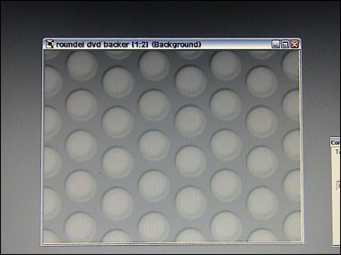
To start on my project, I had to do some fancy footwork to grab a screen shot of a commercial disc’s menu and then replicate the roundel pattern.
I then did the strip across the top with the logo, at roughly the same size, except I built an alpha channel into the black area – I want to put something a little more interesting than still photos up there.
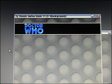
What’s actually going back there is a semi-blurred snippet of the opening titles from the Tom Baker era. It’ll show through the alpha channel area and the logo will float over it.
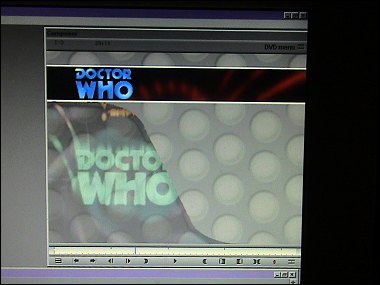
The next task is to create an admittedly less ambitious version of the video montage. I reduced the screen area of the video “curve” to put the menu text over the roundels. The video in question here is a loop of the Tom Baker opening titles.
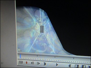
As with the commercial DVD menus, the footage is half-ghosted over a bit of the roundel background. When I created this element, I put a “drop shadow” in the graphic, so the menu area seems to be floating over it. I then key that little slice of video back over the main menu for – hopefully – a seamless fit.
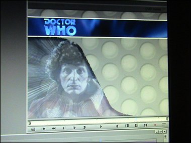
Everything is carefully timed out to loop seamlessly. Appropriately enough, each loop lasts 42 seconds. I also threw together a Pertwee variation:
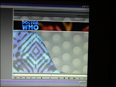
I thought it turned out to be even better than the Baker menu. I’d hope so for the render time: the Avid chews on each of these loops for about 35-40 minutes before outputting a nice broadcast-quality MPEG of the whole thing.
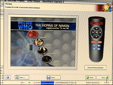
In Nerovision Express, I set that MPEG up as a motion video background, and if I were going to go ahead and burn this DVD, I’d choose – or edit together -42 seconds’ worth of appropriate music. If I had a bonus feature of any kind to go on the disc, it could occupy the somewhat empty right side of the screen below the animated strip that now tells you what the heck you’re watching. I stuck with the Eurostile font as used on the BBC DVDs.
You can see a Flash movie of the raw Baker loop here. Granted, it’d be much more exciting with a montage of episode-specific scenes, but the object here was to figure out how to do this in one night, rather than start paving a road to madness. I realize it’s not perfect – the curved shape is different from the BBC DVDs, to name just one obvious fault. But I’m doing this for fun and to keep myself in practice, not to try to come up with a picture-perfect duplicate of the BBC’s menus. (I’d be expecting a BBC C&D ASAP if I went that far.) And because it’s going to be the 26th season of the new series before they get around to putting episodes like The Horns Of Nimon, Underworld, or the recolorized versions of some of the most important Pertwee serials like The Daemons or Terror Of The Autons on DVD. And hey, if I’m proven wrong, I’ll be the first in line to put my cold hard cash down for the official Terror Of The Autons DVD – because snazzy menus don’t come close to making up for the wealth of bonus material that’s crammed onto each official release.
In the meantime, I’ve gotten the Avid and Nero to make sweet music together, which is a good thing to know how to do. Because even PDF DVDs need snazzy menus.
Skip to content
Being the blog of theLogBook.com's webmaster, Earl Green
You May Also Like:
Categories
Changes in fortune
Categories
The Little Green Men on closeness
Categories
The Little Green Men on hippo feasts
Categories
Conversations with Little C, day 990
Categories
How’s the weather 30 years ago?
Categories

I appreciate the tutorial on your menu making project. I took a Photoshop class last year and whenever we completed an assignment, each of us would present our work and explain any technique used to create it. I learned as much from those presentations as I learned from the text book and lectures.
From your description I think I could build something similar using Flash but it would be limited to a web page (I don’t think you can build a DVD menu with flash can you?). However, I could only do it if the video portions are already built for me (I lack the tools and skill to edit a video properly – Image Ready, Jasc Animation Shop and whatever comes with Windows are the only tools I have ).
CNM offers a course on Adobe Director. That’s the software many developers use to make DVD menus (according to a couple teachers I talked to). Maybe in a year or two I’ll take the class but or now I’ll just use Flash and practice on a smaller scale.
Maybe someday, if I’m inspired, I’ll make a couple Mr. Flibble animations and use the techniques you described for a menu of the Flibble material. It’ll all be done in Flash, of course. I’ll also have to learn how to edit .avi or .mpg files for that project.