I haven’t done one of my “famous film spaceship” things in a while, so here’s one that I’ve had the pictures sitting around for for ages and just haven’t gotten around to organizing and writing.
Though it seems like the buzz about a J.J. Abrams-produced Star Trek movie is going to put off the inevitable retrospectives of the later movies in the series, I still have to stick with my assessment that, at some point in the future, 1994’s Star Trek: Generations is going to be looked upon as the conceptual jewel in the crown of the TNG movies. It seems like it’s really the only one of the four TNG films to even attempt the exploration of a science fiction idea (in this case the Nexus), even if its treatment of that concept suddenly takes a weird right turn in the last 20 minutes that’s never fully explained (the whole bit with Picard and Kirk apparently simply choosing to leave the Nexus and go back just a li’l bit in time). Malcolm McDowell is certainly the TNG movie villain with the most staying power (but I’m biased, as he’s a favorite actor of mine), and Generations also edges out Nemesis (for killing off Data) and First Contact (for re-inventing the Borg) for having the most lasting impact on Trek fiction as a whole (for killing off Kirk). (I also think a reassessment of the movie’s music is long overdue – as much as I love Jerry Goldsmith’s work, it all started to sound similar toward the end of his Trek tenure, and Generations represents, hands-down, some of the best music Dennis McCarthy ever put in front of an orchestra.)
But Generations is also fascinating for what it shows us. Without revamping the exterior of the Enterprise-D for her final voyage, it presents us with significant changes to the well-worn interior sets. What do all these new additions do, and why? Read on, true believers.
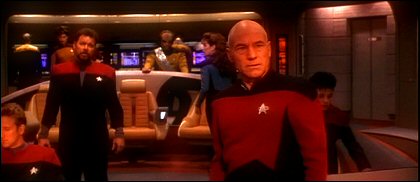
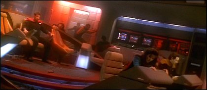
While still essentially the same look as it had on TV, the Enterprise’s bridge has suddenly gained a gob of extra duty stations – at least six wall-mounted stations and two free-standing consoles.
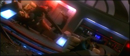
The under-lit “step up” to the command area – previously introduced in the alternate universes of the episodes Parallels and All Good Things… – also apparently becomes official here.
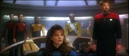
Though from some angles, you can’t tell anything’s changed at all.
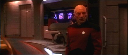
On the side of the bridge that includes the turbolifts and ready room, it’s interesting to note the handrail on the wall. Apparently it takes a couple of centuries for Starfleet’s ship designers to acknowledge that folks tend to get thrown around just a little bit on Federation starships. One can also clearly see here that the “ramps” leading to the upper area of the bridge have become a bit narrow, to accomodate work areas by the new duty stations.
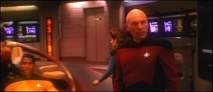
But there’s no need to cry foul – Rick Sternbach and Mike Okuda made allowances for this sort of thing (and probably dozens of other unanticipated set changes) in 1991 with their “Star Trek: The Next Generation Technical Manual.” That book mentions that the bridge is a self-sufficient, hot-swappable module that can be changed out for a bridge with mission-specific instrumentation. So either a special mission requiring all the extra hardware, or a routine upgrade, could be the answer here. (This also handily explains why no two Excelsior or Miranda class ships ever seen in TNG or any other Trek spinoff had the same bridge sets. 😆 )
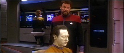
Even with the safety handrails, it doesn’t take much imagination to predict that the unfortunate extras at these new side stations will soon be blown across the bridge, without even so much as a rail over that ramp to slow them down. Clearly, OSHA doesn’t exist in the 24th century.
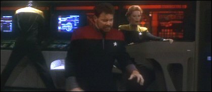
A good clear view of the free-standing console, whose operator can face the main screen. (Um…what the hell is that guy in the background doing!? 😆 )

A good shot of the stations on the other side of the bridge.
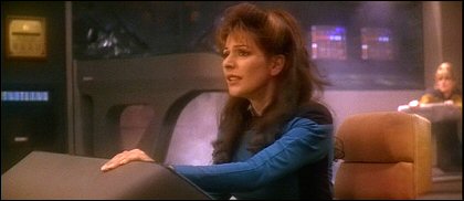
Damage-wise, they seemed to fare a little less well in the ensuing battle.
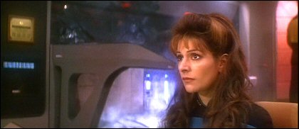
And to add insult to injury, Data had to tear apart and rewire these stations to save the day.
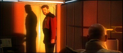
Picard’s ready room, completely unchanged from the TV series, still manages to look strangely different thanks to the late John Alonzo’s unusual cinematography. I liked the idea of the Enterprise being so close to a given star that you’d have this incredibly harsh light from outside all the windows.
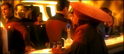
Ten Forward shows the same effect. There’s only a few small problems with this lighting scheme: I wouldn’t have wanted to see something like it more than once, and even once was debatable since various episodes had already shown means by which one could avoid having this blinding light coming in all the windows.

All that light and shadow did do wonders for some scenes, though – such as this one in Picard’s quarters.

We had never seen Guinan’s quarters before, if I remember correctly. It looks like she did quite a bit of customizing.
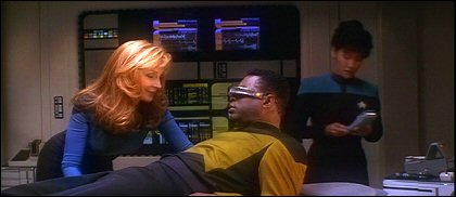
Sick bay appeared with virtually no changes.

Though I wouldn’t have shed a tear if some changes had been made – that light panel thingie in the background looks awfully 1989.
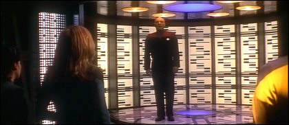
I was equally surprised to see no changes in the transporter room, which had already seen some slightly dubious big-screen makeovers in Star Trek V and VI.
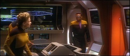

Main engineering.
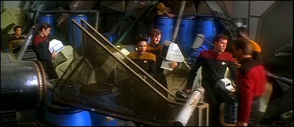
Seen very briefly at the end of the movie, the standard cargo bay/shuttle bay set – now littered with crap!
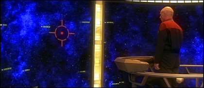
The most eye-popping new addition to the Enterprise is obviously from this scene where Professor X interfaces with Cerebro. Oh…wait a minute.
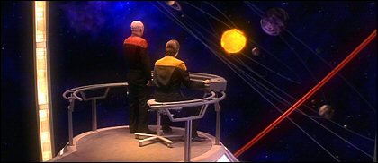
There’s only one hitch – unless this was yet another changeable-outable module, we had already seen the Enterprise’s stellar cartography room (in The Chase, I think)…and this clearly wasn’t the same room.
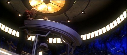
Especially not with the opening shot, which clearly showed us that there was indeed space underneath the platform.
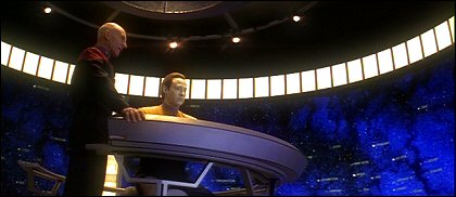
This did away with my theory that it was just the same room, only with a holographic environment overlaying the real walls.

Most likely, it’s just a separate area, perhaps attached to the previously seen room by that door in the background, that we just haven’t seen before. Yeah, that works for me.

(My original “same room with holograms” theory was at least partly fueled by the background controls, which bear more than just a little bit of resemblance to the holodeck “arch.”)
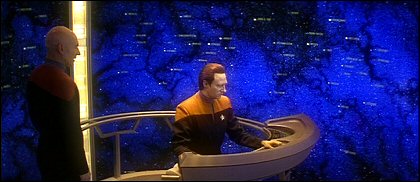
One wonders if the railing is really there just in case someone gets motion sickness from all those groovy rotating displays.
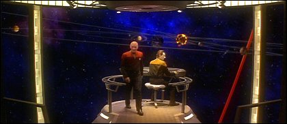
But then, once again…why not rails all the way along the walkway? I wouldn’t want to be in here during a battle.
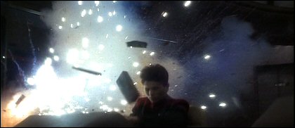
The great thing about this being the Enterprise-D’s last flight? The new bridge stations can blow up real good.
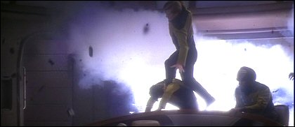
Heck, the old ones can too!
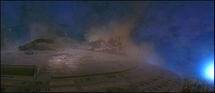
I don’t normally bother with external shots, but I thought it was a great touch that, split seconds before the Nexus destroyed the planet where the Enterprise’s saucer section landed, those unlucky souls who were cleaning up topsides could be seen running like hell. I mean, how much worse could their day get?
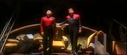
The downside to this being the final voyage: I liked these changes and would’ve welcome more adventures with the new sets. (Maybe they could’ve been introduced in the final year of the series or something.) They made the Enterprise look more functional and less stagey.
Skip to content
Being the blog of theLogBook.com's webmaster, Earl Green
You May Also Like:
Categories
Changes in fortune
Categories
The Little Green Men on closeness
Categories
The Little Green Men on hippo feasts
Categories
Conversations with Little C, day 990
Categories
How’s the weather 30 years ago?
Categories

+ There are no comments
Add yours