I have this one filed under “Toiling in the Pixel Mines,” where I usually comment about work, only it’s really not about my work, which takes us into a whole other area. I’m a big proponent for the democratization of the media, even though every once in a while the democratization of the media brings us something like Bumfights 3. I think the internet and the MP3 format have begun to level the playing field where music and other audio content, such as podcasts, are concerned, and that’s a good thing; now I’m waiting for the democratization of television. “Cable access” has really become something of an illusion in most communities, and so once again, the internet and broadband will be the deliverers of new televisual talent.
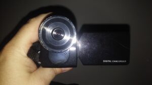
Now, in order to be taken seriously, people need to learn how to make TV work for them. Granted, if we’re talking about stuff that’s going to wind up on an iPod’s screen, maybe there’s a point where you can back off on production values. But data compression does stuff to video that we’ve gotten past with most audio (as I was reminded rather harshly tonight when I posted the latest addition to my work blog). Video for the web and portable platforms is a whole different animal from videotape. But people are still taking the camcorder aesthetic – which really came and went in the popular media with Blair Witch – and applying it to stuff. And there are people who are putting together their own local TV commercials.
It’s this last bit that has me bugged of late. On the one hand, having been a commercial production manager at one of the local stations in the past, I cringe at the thought that what some business owner thinks is going to be a “cost-cutting” measure, bypassing the cost of having someone else produce their spots, is going to wind up backfiring and putting a laughable spot on the air that’ll do more harm than good. I’ve literally seen one local spot that looks like it was shot with someone’s webcam (with no more light than was available from the overhead lights in the room), edited on their PC, and voiced right next to the CPU fan of that PC. The customer testimonials, which are supposed to be heartfelt, wind up looking like they were culled from terrorist ransom tapes. It kinda winds up looking like Manos: The Hands Of Fate 2000.
Message to the business owners of the world: doing stuff like that hurts your message more than it sells it. Trust me. The people running the production departments at your local stations were hired for those positions for a reason. Please, avail yourselves of their knowledge and expertise. Yes, it costs a little bit of money. But it’ll do more for your business than putting something on the air that looks like the last known film of Bigfoot. We might be getting accustomed to stuff on tiny screens and highly compressed web video, but, to be frank, crappiness still shines through.
Trust me on this.
Skip to content
Being the blog of theLogBook.com's webmaster, Earl Green
You May Also Like:
Categories
Changes in fortune
Categories
The Little Green Men on closeness
Categories
The Little Green Men on hippo feasts
Categories
Conversations with Little C, day 990
Categories
How’s the weather 30 years ago?
Categories


When I took my Photoshop class this past semester, a lot of effort was put into teaching us some basics about graphic design: alignment, contrast, repetition and proximity. After learning those basics I quickly discovered how poorly some of the “professional” ads on the local paper were designed. The rotten design usually distracted the reader from their ad. But, then again, if I remained ignorant of basic design principles, I wouldn’t know how bad the ads were! 🙂
Another thing I learned is how to setup a decent background in your web page. The usual technique is to reduce the visibility of the background image so it doesn’t compete with your foreground images. A perfect example of how NOT to do a background can be found at most of the blogs on myspace.com. You can’t read most of the blog entries because the background is drowning out the text!
This just goes to show that great tools like Photoshop, Premiere, Illustrator and so on can only create your design quicker, not better. If you don’t know how to design a good image, these tools won’t help you. They’ll just make it easier for you to do a crappy job.