Having plumbed the depths of the Discovery from 2001, I’m setting my sights this time around on a more mainstream target. In the intro to the 2001 set design piece, I mentioned that the net is oversaturated with photos of nearly everything Star Wars, Doctor Who and Star Trek related. And while I still think this is true, one has to remember that Trek fandom has a somewhat selective memory. For me, the best-looking ship interiors ever to grace the screen in the Trek franchise were seen in what was, for many years, the lowest ebb of the franchise.
One of the things I loved about TNG was the look of the Enterprise. I loved how Herman Zimmerman designed the sets for the ship’s central locale (and thus setting the template for future production designer Richard James to follow after his departure), and I adored those touch-screen computer interface graphics designed by Michael Okuda – “Okudagrams,” as they quickly became known in the Trek art department (and later to fandom). But it wasn’t until 1989 that I saw those two elements married to the more functional, less-living-room-esque design of the original Enterprise bridge as laid out by Matt Jeffries, with the console silhouettes developed for the movie era by the late Mike Miner. While it’s impossible to deny that this was the darkest hour of the original crew since the final scene of Turnabout Intruder, I must admit to absolutely loving one thing about Star Trek V: The Final Frontier…and that is the Enterprise herself.
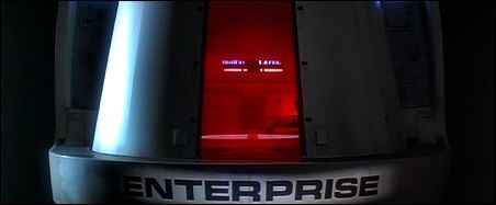
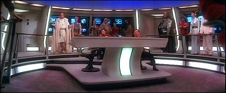
This, to me, was the bridge that had it all – the luxurious, recessed-light-panels, carpeted/upholstered interiors and touch-screen controls of the Enterprise D, and the shape of the original Enterprise’s bridge.
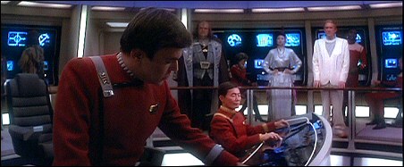
As beautiful as that combination was, it’s a pity that the new ship was instantly pointed up as a lemon in the first half-hour of the movie.
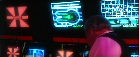
Obviously, a lot of the displays behind the smoked plexiglas were TV and computer monitors, but only where necessary – I noticed that a great many of the displays were static backlit graphics, similar to those seen on TNG.
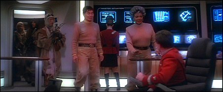
Mr. Chekov, we’re with the Church of Scientology. We’re here to help. If you look carefully in the background, you can even see padded paneling below the control stations at the rear of the bridge – looks like someone else has been watching 2001 too. Actually, considering how much of a beating the average ship named Enterprise takes, you’d think Starfleet would concede to the inevitable and install even more padding than you saw on the Discovery.
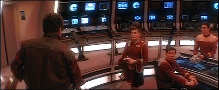
It’s a damn sight better than the paint-it-as-white-as-you-can-and-overlight-it-as-bright-as-you-can 1701-A bridge seen for mere seconds at the end of Star Trek IV.
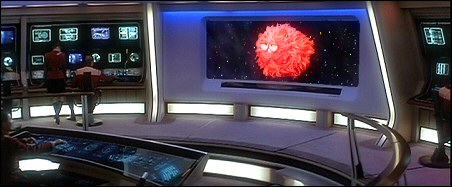
Main screen turn on! It’s you! “How are you gentlemen!” (Obviously from a deleted scene.)
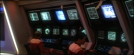
Another examples of how sparsely actual CRTs were used on the bridge set – though it’s still rather obvious which ones are monitors and which are backlit graphics.
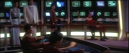
The Enterprise A’s main computer even has a handy “Heaven Mode.” Note the monitor in the upper center portion of the screen – when the ship is approaching a planet that may or may not be Heaven, most of the monitors on the set switch to this strange cloudy graphic. 😆 (I’m sure this was intended to be the computer rebooting/recovering or something, but surely a simple “terminal offline” status message would’ve spelled this out better.)
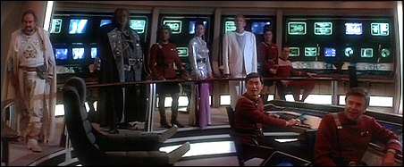
Oddly enough, that’s a second-season Picard command chair at the center of Kirk’s new bridge.
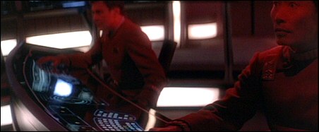
One of the very few close-ups of the helm controls – even the semi-circular layout of the previous movies’ tactile button control arrays was preserved in the touch-screen look.
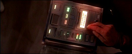
I liked this “electronic Captain’s Log” prop – but thought it was ultra-cheesy that it was in a state of disrepair like everything else.
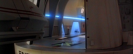
Shuttlecraft Galileo coming in for a landing.
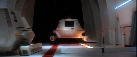
If you didn’t already know this, the Star Trek V shuttle design was chopped in half and reworked into the Next Generation’s Magellan-class shuttle, which first appeared in the fifth season.
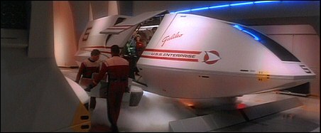
A landing going right.
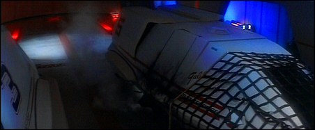
A landing going all kinds of wrong.
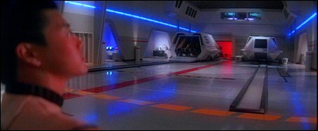
“Attention all hands…shuttlecraft 14…you left your lights on.”
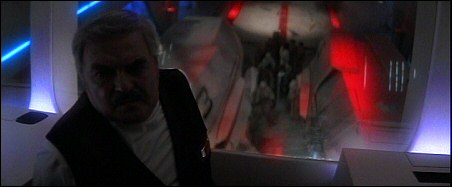
Scotty in the “control tower” overlooking the shuttle bay.
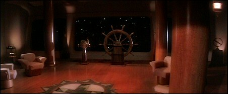
This officers’ lounge set, which just seems impossibly lush for the cramped quarters on a Constitution-class starship, intrigued me with all of its wood paneling and other acoutrements – especially the classy ship’s wheel. In every scene that takes place in this lounge, the stars are approaching, so it’s somewhere on the front of the ship – as if Zimmerman & co. were trying to outdo Ten Forward.
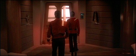
The entrance to the officers’ lounge.
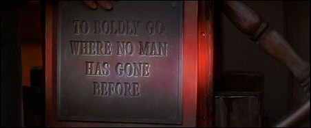
A detail from the ship’s wheel.
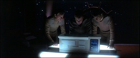
The officers’ lounge apparently also houses this emergency communications console that Kirk & friends used to call home for help.
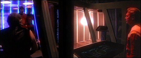
The transporter room aboard the Enterprise A was obviously a pretty cheap redress of the Enterprise D’s transporter room.
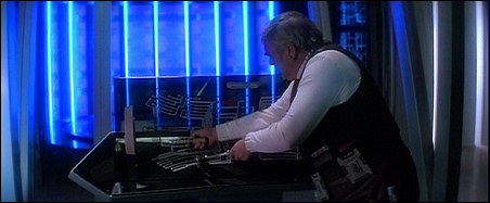
What the blue neon was for, heaven only knows. Despite that, more or less the same redress – minus the club lighting – was used for Star Trek VI.
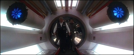
Little was seen of engineering aboard the Enterprise A, and what did appear was a redress of some existing set elements from Star Trek: The Next Generation.
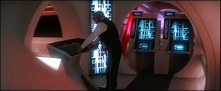
Another unspecified location in the bowels of engineering, where Scotty is still apparently the only engineer on duty aboard the whole ship. Oddly enough, the two standing consoles behind him originally appeared in the first season of Next Generation in the episode Coming Of Age, where they were consoles that Wesley Crusher and other would-be cadets used to take Starfleet Academy entrance exams.
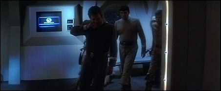
The entrance to the Enterprise A’s brig; strangely enough, there seems to be an honest-to-goodness porthole in the “lobby” area.
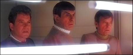
Deadly fluorescent lights keep prisoners confined on the Enterprise.
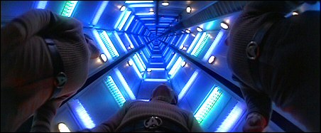
The turboshaft set looked rather neat, whether you’re looking up…
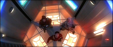
…or down.
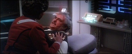
Now, this being a movie, and a movie that happens to be Star Trek V, there are a few things that slipped through and bugged the heck out of me. Even the first time I saw the movie, this sickbay scene bugged me because they didn’t even bother to change out the graphics on the “wall monitor” (see the upper right hand corner) – those are Next Generation graphics, not original-crew-movie-era graphics.
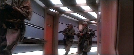
Note that another anachronism – the Next Generation door labels – can be seen in this brief shot.
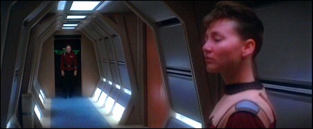
Other than that small gaffe, I think it made perfect sense for these corridor sets to be used – after all, Starfleet has been using them since the first movie, and clearly it was a modular design adapted to any ship.
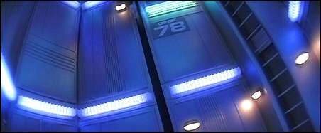
Probably the biggest goof in the entire movie – “Deck 78.” Quite a few fans seem to latch onto this as an example of all that was wrong with Star Trek V; to be fair, I don’t think it was until the third season of Next Generation – which aired after this movie’s premiere – that we nailed down that the much larger Enterprise D was only 50-odd decks tall. Ah well – think of it as Star Trek’s version of Babylon 5’s Grey 13.
When the ship next appeared in Star Trek VI, director Nicholas Meyer decided he wanted the whole thing to look like a submarine, with boilerplate decks, big honkin’ LED clocks on the walls, and tactile controls replacing many of the “touch screens.” But for one shining moment – that happened to take place in one undeniably bad movie – it seemed like the best of both generations met, design-wise, to create the quintessential Starfleet ship interiors. I’d cover the Enterprise of Trek VI here, as I did with the Discovery across two different movies, but it really was a whole different beast. Perhaps another time.
Skip to content
Being the blog of theLogBook.com's webmaster, Earl Green
You May Also Like:
Categories
Changes in fortune
Categories
The Little Green Men on closeness
Categories
The Little Green Men on hippo feasts
Categories
Conversations with Little C, day 990
Categories
How’s the weather 30 years ago?
Categories

Did you ever mail it! The ship interior shots of the Enterprise A for Star Trek V were gorgeous! Wish they would have kept them for VI.