On Deck 78
Having plumbed the depths of the Discovery from 2001, I’m setting my sights this time around on a more mainstream target. In the intro to the 2001 set design piece, I mentioned that the net is oversaturated with photos of nearly everything Star Wars, Doctor Who and Star Trek related. And while I still think this is true, one has to remember that Trek fandom has a somewhat selective memory. For me, the best-looking ship interiors ever to grace the screen in the Trek franchise were seen in what was, for many years, the lowest ebb of the franchise.
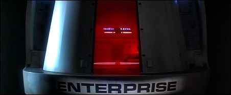
One of the things I loved about TNG was the look of the Enterprise. I loved how Herman Zimmerman designed the sets for the ship’s central locale (and thus setting the template for future production designer Richard James to follow after his departure), and I adored those touch-screen computer interface graphics designed by Michael Okuda – “Okudagrams,” as they quickly became known in the Trek art department (and later to fandom). But it wasn’t until 1989 that I saw those two elements married to the more functional, less-living-room-esque design of the original Enterprise bridge as laid out by Matt Jeffries, with the console silhouettes developed for the movie era by the late Mike Miner. While it’s impossible to deny that this was the darkest hour of the original crew since the final scene of Turnabout Intruder, I must admit to absolutely loving one thing about Star Trek V: The Final Frontier…and that is the Enterprise herself.
 … Read more

