 It’s amazing how you can find nearly any photographic or graphic material related to Star Trek, Star Wars, Babylon 5 or Doctor Who on the web, but there doesn’t seem to be an equally comprehensive archive of images anywhere from 2001: a space odyssey. Now that omission, dear friends, has to be a crime somewhere in the world, for 2001 boasts some of the most beautiful and logically, functionally designed sets ever to grace a soundstage in the name of science fiction. It’s time to fill this gap.
Beware, clicking on the following “more” button will take you to a page with lots of rather large pictures like this one. But if you’ve got the bandwidth and the time, venture forth into HAL’s memory core for a tour of the Discovery.
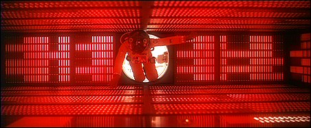
Before we get going, of course, all 2001 stills are taken from the DVD, and are © by MGM.
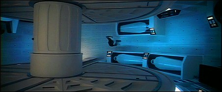
Production designers for 2001 were Ernest Archer, Harry Lange and Tony Masters, with uncredited contributions from interior designer Olivier Mourgue.
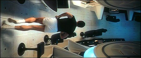
The mind-bending, “how’d-they-do-that-then?” opening sequence, in which a member of Discovery’s crew is seen to run around the full circular living space of the ship, was accomplished by building the completely circular set on its side and rotating it; the actor (and the camera) ran in it like a hamster in a wheel as it turned. (In the novel, the rationale for this circular section is that a series of flywheels keeps this section spinning to create artificial gravity.)
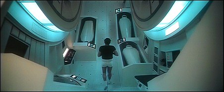
In the scenes where the camera doesn’t appear to be fixed, there’s a more noticeable gap between some of the floor tiles in the center of the screen; presumably, the camera – still actually fixed – was mounted via a support which portruded through that gap, making it appear to follow the actor; in actuality, the camera and the actor were nearly stationary and the entire set was doing all the moving.
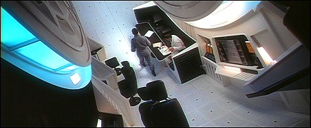
Logically enough for a circular/spherical space, even normally flat surfaces are curved, such as the table in the dining area.
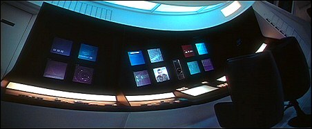
Even adjacent chairs and workstations appear to be slightly askew relative to one another. This portion of the set seemed to be the crew’s primary interface with the HAL 9000 computer.
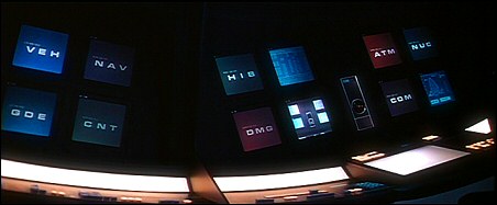
A closeup of the same station; the “screens” were all film loops projected from behind the set, though now one would presume those film screens are standing in for flatscreen LCD monitors (already installed aboard the space shuttle). Numerous three-letter abbreviations seem to indicate what system’s status is about to be shown.
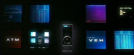
As best I can tell, these are all of the abbreviations:
- NAV = navigational systems
- GDE = ??
- HIB = hibernation systems
- NUC = nuclear (power) systems
- FLX = ?? flux? what would be in flux?
- COM = communications systems
- ATM = atmospheric systems
- CNT = control systems? (i.e. attitude/orientation control or gyrostabilization, as opposed to navigation?)
- DMG = damage control systems?
- VEH = vehicle status (but if it is, how does this differ from DMG? Could it be related to the pods?)
- MEM = memory systems? (presumably HAL’s)
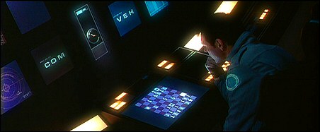
Another flat screen at the HAL interface station, possibly also a touch screen, though we don’t see it used as such.
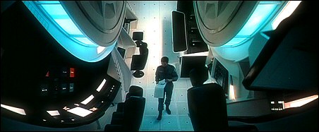
Another “rotating” shot from later in the movie; in this instance, the camera appears to be mounted through the floor again, in front of and above the cast. At the bottom center of the screen, again notice a more pronounced gap in the floor tiles, through which the camera could have been mounted.
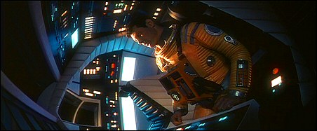
Poole suited up in the “cockpit” area of Discovery during Bowman’s first EVA; as he’s sitting stationary in a position that’s facing down relative to the main windows (which correspond roughly to the long, curved window on the front of the Discovery miniature), presumably the cockpit does not benefit from the centrifugal artificial gravity of the rotating part of the ship.
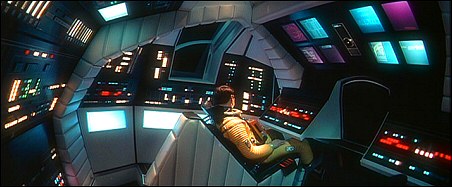
Another cockpit view.
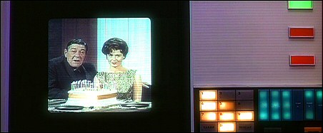
The panel where Poole sees the birthday message from his family; all those big bright buttons are a little low-tech…but really not that much. Earlier in the movie, Poole and Bowman are watching “BBC 12” (ha!) on portable flatscreen monitors (tablet PCs?) that appear to anticipate the screen ratio of HDTV…though they’re vertically oriented instead of horizontally.
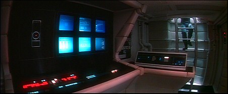
A control station in the pod bay, accessible via the ladder or the pod bay itself.

Presumably that door can be closed, and this area manned as a “control tower,” during EVA activity when the entire crew is out of hibernation.
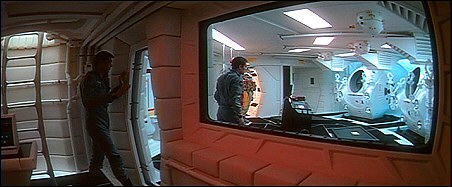
Or at least it sure looks that way.
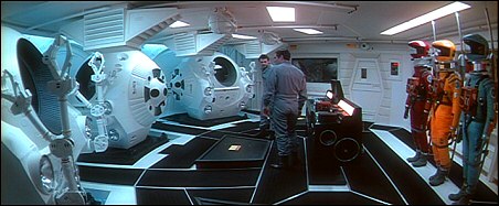
Notice what appear to be speakers at the base of the HAL pod bay “work bench”, and big speakers at that; this detail was missed when this set was recreated for 2010. I guess HAL can throw out some slammin’ tunes while you’re fixing your pod.
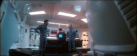
Notice how w-i-i-i-d-e the lenses are that Kubrick used; also note another door on the right, leading to something that might be an airlock, a storage space, or both.
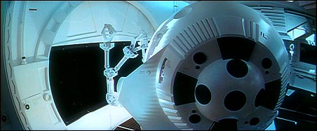
Though fisheye lenses are used for HAL’s point of view shots, there are other times when the lenses are so wide, they’re nearly fisheye as well.
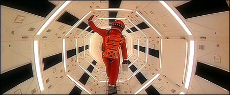
The airlock seen through the door on the right. Compare to the hallway of the Tantive IV as seen in Star Wars, 8 years later. Also see the hatch on the right – stowing space for emergency EVA or first aid gear?
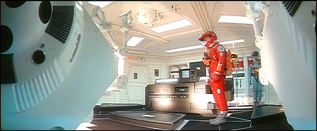
OK, the hi-beams are working. Turn ’em off, HAL.
…HAL?
I can’t see crap now. Thanks, man.
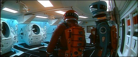
A good look at the pod bay rack holding three EVA suits. Or is that Ambassador Sinclair hanging out back there? Valen maybe? (Trivia: a recreation of that blue suit from 2010 was later rented by Babylonian Productions for Michael O’Hare to wear as Sinclair in the Babylon 5 episodes Babylon Squared and War Without End.)
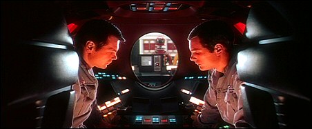
Inside a Discovery EVA pod – again, one of the most functionally designed vehicles I’ve ever seen in filmed SF.
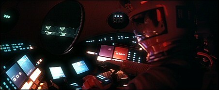
Again, rear-projected film loops provide displays that, in this day and age, look eerily like LCD flatscreens, right down to that slight apparent image degradation when you view it from an awkward angle.
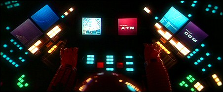
A great overhead shot of the pod controls.
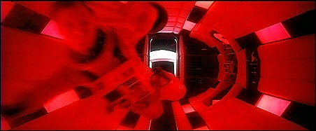
A different airlock from the one seen above, glimpsed only briefly as Bowman forces his way back into the ship.
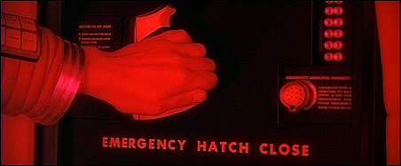
This airlock’s emergency hatch control; for whatever reason, there’s a wall jack for an enormous, multi-pin plug that resembles nothing so much as the connection for a professional video camera from the mid-to-late 1980s.
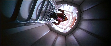
Look at this picture, and all the rest, and notice how much padding there is installed in almost every area of the ship. I don’t know how much it’d actually help if you were in this vertical access tunnel if something caused a sudden movement of the ship, but if you’re going to go crazy like HAL, the walls on the Discovery are already padded.
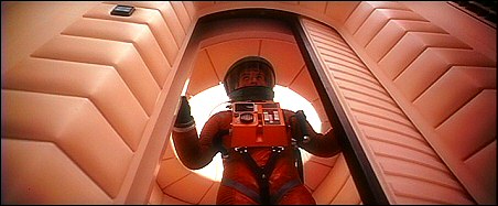
More padding, even at the top of this area; it doesn’t pay to think about how that would come in handy.
I’ve read very little about the making of this movie – and believe me, I’d love to learn more about it, because while the story told by the movie fascinates me, there are lots of techniques used to tell that story that I’d love to learn about. Anyway, as such, please treat all of the above with a grain of salt, as it’s just my conjecture – but when all of that conjecture is based solely on having seen the movie several times, and just my own lay knowledge of how one might put a ship like Discovery together, it’s clear that Stanley Kubrick and the designers working for him provided lots of clues for those who notice these details. While I normally roll my eyes at movies that go out of their way to linger lovingly on the sets to show off how much money must’ve gone into this thing, 2001 is one film I allow to get away with that shamelessly. All the attention that is lavished on the sets, and on showing those details, just makes it more real for me. And hopefully for you too.
Bonus: The Discovery In 2010
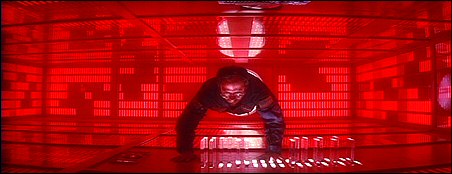
Production designer Albert Brenner and his crew had their hands more full bringing Discovery back to life in 1984 did than the fictional American astronauts did in 2010: The Year We Make Contact. Not much remained in the way of documentation of the design and construction of 2001’s sets, as Kubrick had all of that material – and the models and sets themselves – destroyed so they couldn’t be reused in later films. While the art department scored and scored big in some respects – the Leonov, with its funky rotating centrifugal section, was practically copied by Babylon 5’s Earth Alliance destroyers years later – 2010, despite contributions from futurist/artist Syd Mead, winds up looking in places more like 1984: The Year We Made This Movie, never mind The Year We Make Contact. The movie didn’t even attempt to do anything that would necessitate the recreation of Kubrick’s spectacular rotating set, but it did recreate several other locales aboard Discovery…1980s style.
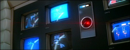
One of my biggest disappointments with 2010, even back when it came out, was that HAL’s nifty array of screens turned into what were obviously TV monitors, showing graphics that were obviously a little more Odyssey2 than Space Odyssey.
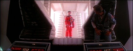
In many respects, the portions of Discovery that were recreated for 2010 were surprisingly well-done; such details as the cockpit seats pointing downward survived…
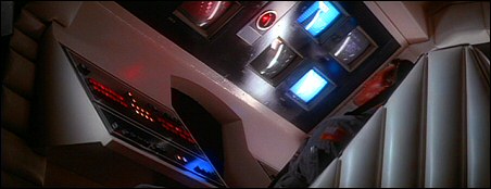
…even though the way the movie is shot in places could almost make you think otherwise.
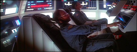
Perhaps the biggest problem with the way the Discovery was shot in 2010 was a matter of cinematography, not set design. In many scenes, the sets seemed – at least compared to 2001 – vastly overlit. To be fair to Peter Hyams, who both directed and lit the movie (and adapted the script in consultation with Arthur C. Clarke), there may be a plausible story explanation: Discovery in 2001 may be operating in a partially powered-down mode since three of its five crew members are in hibernation.
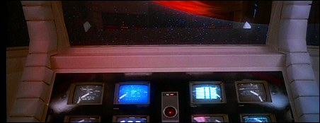
I’ll give them this: Kubrick never even tried to show the view from Discovery’s pilot seat in 2001.
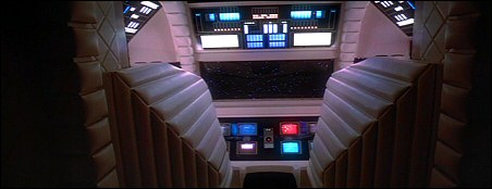
In places, if you overlook the TV screens, you can almost fool yourself into thinking that some of these shots are from 2001.
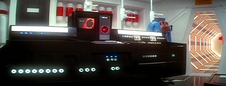
HAL’s pod bay workbench again.
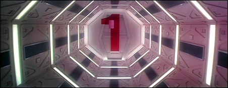
I don’t believe the enormous numbers “1” and “2” appeared on any airlock hatches in the original. Another missed detail: note that the storage hatch is missing; if this airlock leads to the pod bay, the hatch should appear on the fourth vertical panel on the right.
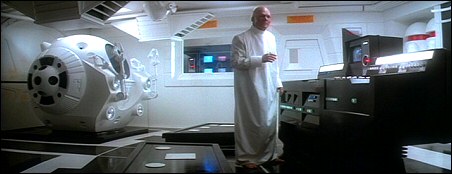
Also, HAL’s huge workbench speakers appear to be missing.
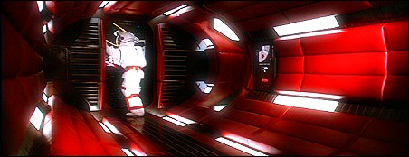
A decent recreation of Discovery’s emergency airlock, seen literally for only a couple of seconds in 2010. We don’t ever see this airlock without “red alert” lighting in 2001, but I always presumed that its padding was white as with the rest of the ship; here, the set designers and dressers for 2010 seem to have presumed that the padding itself was red all along.
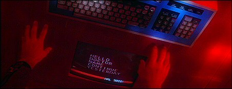
Another sure sign of the 80s rears its head: Big Chunky 1984 Computer Graphics, apparently powered by a Big Chunky 1984 Keyboard. This scene takes place in a previously unseen part of HAL’s memory core room, but it just seems anachronistic next to the crystalline memory modules (which were recreated from 2001).
I’m not taking the makers of 2010 to task for their work; it’s impressive that they got as close as they did, and also impressive that at no point during the movie’s production did anyone say “Screw the details, who’s gonna remember?” But that’s what nerds like me are for, and despite 2010’s occasional 1984-isms, the designers and builders and dressers of the Discovery sets are to be commended for getting as much right as they did.
OK, I think I’m done geeking out for today (and the crowd says in unison, “Thank God!“). I like a good bit of set design now and again.
Oh, and lest I forget, all 2010: The Year We Make Contact stills are, again, from DVD and are © MGM.

Thanks for the pics PDF! I always enjoy a view or two of 2001 or even of 2010.
Although I noticed the big chunky text on 2010 I hadn’t noticed that 2010 used CRTs instead of rear projection. Just another reason for me to get more annoyed with 2010. :\
Obviously I have issues with 2010 but I am also conflicted about criticizing it and comparing it to 2001. I’ve heard several film critics point out that 2001 is an art film which means it’s purposes and goals are radically different from a much more commercial film like 2010. And let me make this clear, 2010 is a commercial film; not an art film in even the slightest manner.
The chunky text is a simple reminder of that fact. When making 2001 Kubrik stressed the importance of realism in the film: the way the astronauts talked, the look of the spacecraft and interior sets and the look of the computer displays. When I see the spacecraft of 2001 I immediately think of NASA with the white paint and the simple geometric shapes (the cylinder and gumdrop shape of the Apollo command module vs. the sphere and stick shape of the Discovery). The look and feel of 2001 was a key aspect o the movie and Kubrick put a lot of effort to get exactly what he envisioned.
Beiong a commercial film, 2010, used whatever it had on hand to give the sets a futuristic feel at a reasonable price. Chunky text might have looked futuristic to the public in the 1980’s but none of the computer professionals were using chinky text (80 and 132 column text terminals were the standard for most commercial systems of the day – only consumer computers like the Atari 800 and the C64 used chunky text). Setting up a C64 or two to display the text was cheaper, I guess, than the cost of setting up rear projection units or even setting up a couple commercial text terminals (a VT100 terminal in those days cost around $700 – you could get several C64s and monitors for that price). Either that or the set desigenr thought it would be cool to hook up a bunch of cheap computers to montors and make it part of a spacecraft.
As a result of this art film/ commercial film difference, you can’t compare the movies in a fair manner. Heck you can’t even compare the two books for the same reason. Thus, the criticism that 2010 is a lesser work because much of the book was spent explaining the mysteries from the first book just isn’t a valid criticism, IMHO. It would be impossible to write a sequel to 2001 without some kind of explanation of events from the previous book. The same goes with the movies and any complaint I make about the 2010 movie has to be tempered by that fact.
However, I still have lots of complaints. 🙂
The thing that bugged me the most about 2010 is the big “message” in the movie and the cheesy way they presented it: “Let’s get along with the Soviet Union.” The message was fine but the cheesy way they did it was nauseating: “Something wonderful is going to happen”. Bleh! I nearly choked on that when I saw it in the theater in 1984.
The book was more realistic and matter of fact: the obelisk aliens didn’t care about the conflict between the US and the USSR. If humans killed themselves that would have been tragic but it wouldn’t sway the aliens from their primary mission: to push animals into the realm of intelligent beings. What the intelligent beings did with their newfound intelligence was of little consequence to the aliens, they just wanted to give the animals a chance to become intelligent.
With that in mind, the cheese factor gets even worse at the end of the movie when the aliens, by way of HAL sending a radio transmission from Discovery, send out a peace message. It was inconsistent with what we already knew about the aliens (even more so when you read the other Odyssey books) and it struck a false chord. (And boy, my head was hurting from all the eye-rolling I was doing while watching the movie for thee first time).
Worse, the movie dates itself within just a few short years. With Glasnost, SALT talks and the Berlin wall going down, the military and political tensions the movie worried about faded away before the decade was over. 2001, however, still has many relevent themes and it’s sense of wonder – a primary theme of the movie – is still as fresh as it was forty years ago.
2010 missed an opportunity to become relevent and even prophetic by eliminating the Chinese from the movie. In the book, the Chinese sent a manned probe to Europa (or Io, I can’t remember) and we got a glimpse of how important that little moon had become to the obelisk aliens. This showed what a major player the Chinese were in the space race and it’s very prophetic of China’s current and future role in space in the real world. By chopping the Chinese out of the picture, the movie missed an opportunity to become relevent years after its premiere.
I hadn’t made the connection between the Soviet spacecraft and Babylon 5, thanks! The look of the Soviet ship just screamed “I was made in 1984!” and it is such a surreal juxtaposition when seen next to the Discovery. When I see the Soviet ship, I think Star Wars and not 2001 and it’s yet another reminder that 2010 was a commercial film and not the art film 2001 was.
Sorry for the rant and the babbling. Obviously I enjoyed this blog entry! 🙂
I think 2010 is entertaining, but man, if there’s a movie I wouldn’t want any sequel compared to, it’s 2001. There’s just no way in hell anything could’ve measured up – and in some respects, by taking the steps he did to eliminate the material that potentially could be used to make a sequel, I think Kubrick knew he was raising the bar. Though I don’t think even he himself correctly estimated just how much.
The funkiness of the Soviet spacecraft in 2010 is kind of endearing because, well, real Soviet/Russian space hardware is funky and ungainly and yet reliable. I’ve got a whole book on Soviet-era space hardware, and in a couple of centuries, I could imagine that design line creating something like the Leonov. My biggest beef with the Leonov is the interiors – gah!! Whole WALLS of blinky colorful buttons – it was almost like the “future” design aesthetic of the pre-Star Wars 70s. Very Logan’s Run. But when they knocked the lighting in the Leonov right down to ambient lighting, well, that was what I thought the Discovery was supposed to look like (but, in that movie, didn’t).
Glad everyone liked the blog entry – I’ve gotten a couple of e-mails on this one too (c’mon people! sign up and reply here! would it kill ya?) so I’m already thinking about what locale or ship to cover next. If anyone’s got suggestions or requests, and I’ve got access to the material, I’ll give it a shot again when I have the time.
I agree that 2010 is very entertaining – as long as you ignore the cheese facor.
Suggestions for future pics:
Silent Running – A few pictures of the ships Battlestar Galactica decided to copy, er, homage, would be cool. Huey, Dewey and Lewey doing their thing would be cool too.
Zardoz – The flying head isn’t exactly a spaceship but it was cool nevertheless
THX1138 – I liked the look of that movie.
Andromeda Strain – Not a ship but the underground complex was a really cool place to see.
Lots of 70’s goodness there.
As an aside, proof that I am a 2001 nerd:
A while ago I memorized the following dialogue and can recite it on demand:
X-ray-delta-one, this is mission control.
Roger your one niner three zero.
We concur with your plan to replace number one unit to check fault prediction.
We should advise you, however, that our preliminary findings indicate that your onboard niner triple zero computer is in error predicting the fault.
I say again, in error predicting the fault.
I know this sounds rather incredible but this conclusion is based on results from our twin niner triple zero computer.
We are skepical ourselves and we are running cross-checking routines to deterimine the reliability of this conclusion.
Sorry about this little snag, fellows, and we’ll get this info to you as soon as we work it out.
X-ray-Delta-One, this mission control, two zero four niner, transmission concluded.
I can recite it accurately as long as I don’t think about it. I thought about it as I typed it up and made several mistakes.
So there you have it, I don’t keep 2001 models or action figures. I don’t maintain a 2001 fan site or attend 2001 conventions. Instead I remember a bit of obscure dialogue from the movie. 🙂
Oh, I might laugh long and loud at the thought of someone remembering that dialogue, if not for my own specimen of a niner-triple-zero jammed between my PCs. 😆
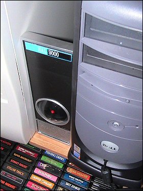
So far I’m happy to report it hasn’t tried to kill me. Yet.